Beginning Pastels - Part 3.
Posted on
Beginning Pastels – Part 3
by Anne Kerr
Last ime I left you with a photograph to use as a reference for your pastel painting. I suggested you choose your own colour scheme and change anything in the photograph to make a balanced and pleasing picture. I hope you gave it a try. Here are both the materials and the method I used to complete my own version of the photograph.
Materials I used:
Soft pastels, a mixture of Unison and Rembrandt.
Pale yellow, Cream, Pale orange, Bright orange, Turquoise blue, Blue/violet, Violet grey, Dark blue/green, Mid green, Dark green, Ochre, Rich dark warm brown.
Canson Mi-Teintes ‘Touch’, pastel paper in cream, size 50cm x 30cm.
Size 6 pastel blender,
Pastel pencils in dark grey, dark brown, cream and light grey
This is how I painted my picture
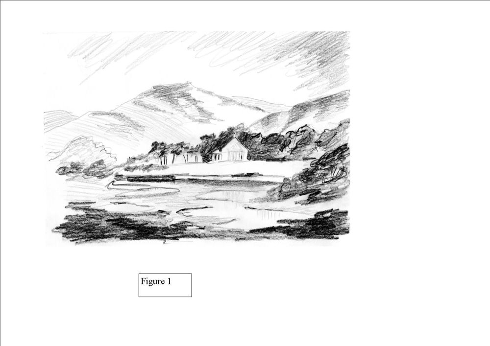
Using the reference photograph as a guide, I made a quick tonal sketch using a 2B and 6B graphite pencil, see figure 1. I changed the shape of the mountain slightly, moving the place where the mountain and hill met to a spot nearer to the building. I decided I would add small puddles to the foreground to break up the rather uninteresting terrain.

I used my dark grey pastel pencil to sketch in the basic outline of the picture. I made the drawing slightly darker than usual to aid photography and printing. See figure 2.
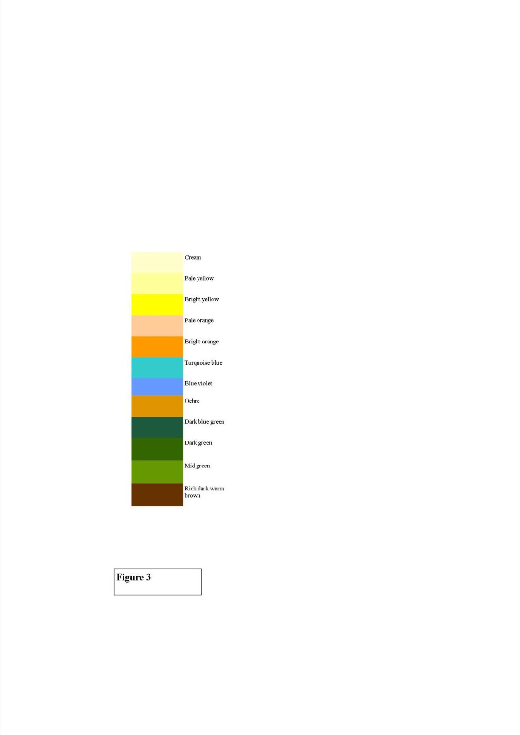
I then decided on the colour scheme for my picture. The actual photo colours are not very exciting although the view is lovely. I decided on a palette of mainly violet, blue, yellow and orange. I wanted some strong contrasts, so complimentary colours seemed appropriate. You can see the full list of colours I used in Figure 3
 .
.
When I am painting with pastels, I usually start from the top so that I am not putting my arm over my finished work and smudging it. Sometimes I drop my darkest darks and lightest lights into the picture, so that I know all other tonal values must fall between these two. However, I chose not to do that as I had a good tonal sketch to work from.
Figure 4
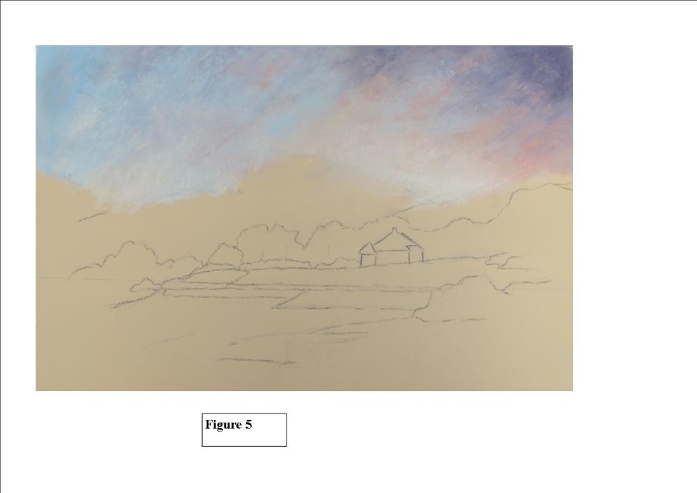
Using cream, pale yellow, bright yellow, pale orange, turquoise blue, blue violet and violet grey, I mapped in the sky area. I kept the brightest area near to the centre of interest which was above the building and also the area where the mountains and hill met. I used the broad side of my pastels so that I covered a fairly large area each time. (always take the papers off your pastels or you can’t do this). I made sure my colours all overlapped each other so that no hard edges would appear. I was careful not to use too much of the violet grey as the colour is very strong. I could always add more later.
Figure 5
I softly blended these colours together using my finger tips. I then went back over the sky with some of the same colours using a very soft gliding stroke. I left these areas unblended. Good quality pastels have little mineral grains in them that sparkle. If you heavily blend everything into the paper the little sparkles get covered up and your painting can look flat and dusty. By all means blend to give the appearance of distance or to show soft lines but try to keep blending to a minimum. Once I was happy with the sky I moved on to paint the mountains.

Figure 6
Using the broad side of my pastels, I lightly stroked in areas of colour on the large mountain. I used pale orange, bright orange, pale yellow and violet grey. I left approximately a third of the paper showing through my pastel marks. There is no point using a coloured paper if you don’t let it work for you. I also added pale yellow to the base of the area that would become dark green trees. However, this may not be easy to see on the cream coloured paper. On the tiny mountain in the distance, I used pale orange, violet/grey and cream. I lightly blended this as no detail would be visible at that distance. I dropped these same colours into the small mountain right over on the left side of the picture.
Figure 7
On the large mountain I used my pastel blender to stroke in rock like features, following the undulations of the mountain. I made sure I left plenty of the texture of my initial pastel strokes unblended. Using a sanded paper likeCanson ‘Touch’ enables you to leave lovely textural marks that add character to the work. I kept wiping the tip of my pastel blender on a cloth so that I didn’t keep taking the dark pastel into my lighter pastel areas.
Figure 8
I used the same violet/grey to stroke in patches on the right hand hill. I introduced a little dark blue/green and bright yellow for contrast. I used pale orange and pale yellow on the bottom of the hill. This would ensure that when I painted the dark trees, they would have light showing through them (counter change). I added pale yellow and cream along the picture at the base of the tree areas. I added soft strokes of yellow/green to the left side of the big mountain and some strokes of bright yellow and orange to the sky.
Figure 9
I painted the house using cream and light grey pastel pencils. I rarely use white as I find it is a rather ‘dead’ colour. A very pale cream is much more pleasing on the eye.
I used a small piece of dark blue/green pastel and flattened one side by rubbing it on a piece of masking tape. I used this flat side to gently stroke in the dark green trees (using a letter ‘c’ shape). I made sure I left plenty of background showing through the trees, especially at the top and on the right side where the light would hit them. I added a small amount of yellow green and touches of bright orange just to give the trees some character. I made sure the tree area around the building was very dark to make it stand out (counter change). I was not happy with the right hand hill, so I rubbed off all the trees using a piece of kitchen paper and added some pale yellow and cream near the tops of the tree area. I then ‘replanted’ the trees! So, yes, you can change things when you paint with pastels. Just make sure you don’t blow the dust into the room. Do that outside.
Figure 10
I used bright orange and bright yellow for the land in front of the building. This was my focal area so I wanted it to shine. Again, I left some of the paper showing through the pastel strokes. The grassy area in front was done by stroking yellow/green and mid green over a base of bright orange. Tiny touches of dark green were added to the top and stroked gently downwards. I painted the road and little path to the beach with cream and a touch of violet grey. I added dark edges with my pastel pencils. The bushes on the far left of the painting were just strokes of mid green and dark blue/green using the broad side of the pastels. Plenty of paper was left showing through and no details added to this area.
Figure 11
I first lightly stroked bright orange, pale yellow and cream into the area behind the right hand bush. Then, using the same method as I used for the background trees, I painted the bush with dark green leaving plenty of gaps. I added little touches of bright orange just for interest. I drew in the odd branch here and there with dark brown pastel pencil. I painted in the areas of the puddles using the sky colours and used pale orange all over the foreground, again, allowing about one third of the paper to show through. I then used my ochre, yellow/green and pale orange pastels to complete the foreground. The only bit of blending I did was on the left side and under the bush on the; where I pulled out some of the bottom of the bush into a shadow shape along the ground. I edged the areas of water with brown pastel pencil and pulled down some reflections using the side of my little finger. I completed the picture by adding the windows to the building and a lovely rich dark warm brown to the very front of the painting. Again, just gentle strokes and no blending. I was very pleased with the result, as I thought the colour scheme I had chosen really livened up a beautiful scene.
Final thoughts
You have probably noticed that I did very little blending while painting my picture. Blending has its place, but not all over the work. You will see in my painting, places where I have used complimentary colours, counter change, tonal contrast, all in a well balanced picture. All features that we mentioned last month.
If you had a go at this painting I hope you enjoyed it. If you didn’t have time to do it, why not try it now using my painting as a guide? Pastel is a wonderful medium, so forgiving and versatile. Yes, pastels are messy, but you only have to keep a damp cloth with you whilst working and wash your hands well at the end. I always paint with a damp cloth in an old plastic box on the table and a small towel over my shoulder so I can constantly clean my hands. If you are about to buy new pastels, I would recommend not getting ones that are extremely soft until you get used to them. A medium hard pastel is easier to handle. I nearly always use Rembrandt, Unison and Terry Ludwig (when I can afford them!). If you haven’t done so already, try using a lightly sanded paper. Something like Canson Mi-Teintes ‘Touch’ or Fisher 400. The texture of the paper will really work for you. I really hope you have found this very brief introduction to pastels useful.
Enjoy your painting!
